Vol. III: April–June, 2002.
- Size celebration the wrong way… (Glamour magazine’s “diet ad”)
- Was the original MODE really that good? [Summer ’97]
- Only a conduit… [Finding a cure for cultural amnesia]
- The True Alternative [The heresy of timeless beauty amidst faux-radical modernity]
- The Time Machine [Bringing the past into the present with the Vienna Philharmonic]
-
A Big Myth: “Clothes Look Better on Thin Women”
- Kate Dillon: Goths and Curves
- Death Aesthetic vs. Life Renewal [Modernist architecture—a parallel]
Size celebration the wrong way…
What’s wrong with this picture?
We have always been skeptical about attempts to integrate straight- and plus-size models in one publication, and if the Vogue “Shapeless” issue wasn’t justification enough for our skepticism, the current issue of Glamour certainly is.
The May Glamour gets some things very right, and many things very wrong. As Mrs. Sader has mentioned, the message of the magazine is as mixed as the sizes of the women in it, and the pictures (with one exception) severely undermine the issue’s “love your body”-type text.
To put is bluntly, writing the words “I love my butt” on a model is meaningless if the woman in question has the kind of slim build that the media says women should love anyway.
The image below, featuring Ford 12+ model Alice Barstow, underscores the problem which often arises when the straight-size fashion industry is confronted by a plus-size model.

The purposes of this page is ostensibly to celebrate the model’s freedom from the diet regimen that she once imposed on herself. But is that the message which it actually conveys? Hardly.
If this graphic is meant to support the idea that the model’s current, fuller-figured state is preferable to her previous, underfed appearance, why is the “undesirable” image so much larger than the “preferable” one? Shouldn’t the emphasis be on the way she looks now, as the body type to which women actually should aspire?
And why is the model wearing a bikini in the “me then” image, while in the “me now” pic she is dressed in a loose-fitting casual top and pants, giving little idea of her current shape? If we are decrying the effects of starvation, shouldn’t the model’s present shape be the focus of attention? After all, this is a swimwear-oriented issue. Why isn’t the “me now” Alice Barstow in swimwear—in fact, why is she not dressed in the same style of outfit that she sports in the “me then” image? Wouldn’t that be the logical way to send the message, “Thank god she stopped starving”—the message that readers are supposedly meant to infer here?
“Improvement” sequences always follow a worse-better image pattern, such as the “before-and-after” feature shown on p. 88 of this very magazine. So why does the model’s “me now” pic (purportedly the “worse” condition) precede her “me then” shot? Doesn’t the before-and-after pattern naturally suggest that the “better” image should follow the objectionable one?
And why is Ms. Barstow’s pose in the “now” shot so self-deprecating, while in the “then” image it is seductive? Doesn’t this send the message that in going from thin to full-figured, she lost her ingenue qualities and become a…soccer mom?
This page is so aesthetically loaded in favour of the “starving” image that the text—describing the punishment that Ms. Barstow had to impose on herself to look that way—will not persuade many viewers of the superiority of her current, full-figured state unless they are already of that opinion. And since this magazine is Glamour rather than MODE, most readers will not be so inclined. In fact, this page is likely to send most Glamour readers flipping back to the last diet ad they saw in the issue, thinking, “How can I look like Alice Barstow…then?”
And perhaps that was the point of the image comparison all along. That, or a graphic designer somewhere is having a good chuckle about having done his part to stymie the proliferation of an aesthetic that he/she loathes.
For all its faults, MODE never pulled a stunt like this. And we trust that Grace won’t, either.
April 9, 2002
Was the original MODE really that good?
Let’s alleviate any suspense and give you the answer right away:
It was even better than you remember it.
In 1590, Christopher Marlowe, Shakespeare’s great predecessor, revolutionized Elizabethan theatre with his play, Tamburlaine the Great. Even today, this work retains much of its power to shock and amaze. Not only did it essentially create English drama and iambic pentameter, but the play was astonishingly immoral—not for any salaciousness, but because, as a true work of the Renaissance, it eschewed Christian ethics, and oriented its moral compass along Classical lines.
The title character, a proud, remorseless conqueror who announces—
I hold the Fates bound fast in iron chains,
And with my hand turn Fortune’s wheel about;
And sooner shall the sun fall from his sphere
Than Tamburlaine be slain or overcome.
—such a character, by the prevailing value system of the day, could only have been considered a villain. But Marlowe unambiguously makes him the hero of the piece.
It wasn’t until Friedrich Nietzsche, four centuries later, that any Western author so totally turned commonly-accepted morality, the morality of custom, on its head.
MODE was like that, or at least the early MODE was. Examining back issues from 1997 and 1998, we still marvel at the audacity of the concept, and the brilliance of its execution. The editors, photographer and models involved with this project knew quite well that each issue was a slap in the face of the fashion establishment, and demanded a radical rethink on the part of every reader.
Sadly, as you peruse the run of the magazine, you see that MODE became less and less revolutionary as time passed. The models certainly did become smaller, and generally less attractive, and were photographed in increasingly slimming ways. But for the first two years, perhaps three, there was a degree of extravagantly feminine beauty and ebullient immorality (i.e., a defiance of custom and convention) in MODE that was absolutely unique in popular culture.
Let’s take the Summer ’97 issue as an example. The first four quarterly editions of MODE might be considered its “experimental” versions, and what amazes us most is that right from the beginning, MODE got the formula just right.
Consider the famous Natalie Laughlin cover. Sure, it’s revolutionary because the model is dressed in a sleeveless gown that reveals her cleavage, but what you might have forgotten was that this garment was tailor-made for Ms. Laughlin. A page in the magazine describes the steps that the magazine took in having this dress custom-made, and the write-up is introduced with the slug line, “Hey, Badgley Mischka: why not size up your line and give us an extra inch or two—or more. This is what one of your designs would look like on your most curvaceous fans.” As much as it challenged readers, MODE challenged the fashion industry even more.
And right there on the cover, in big pink characters, are the words, “Style in sizes 12, 14, 16…” No nonsense about this being a magazine for “every” body. Smaller women have dozens and dozens of magazines to serve them, but this one, those numbers say, is for a group who has never had one of their own. Once MODE took those numbers off its covers, it lost its focus, and the end was near.
Perhaps the best article in the issue is titled “’Round the World.” The point? That the fuller female figure is preferred is every corner of the globe, except for North America. Brilliance, sheer brilliance. The story includes images of attractive women from other countries, quotations describing the preference of foreign men for women of substance, and statements on the part of the women themselves, testifying to their freedom from any inhibitions about eating and dressing provocatively. (Quote: “In Europe, food is meant to be savored, and women—get this—are actually encouraged to eat.”) “’Round the World” uses a similar technique to that of this site by presenting readers with an alternative culture to the one in which they live, and this discovery encourages readers to realize how ephemeral and localized the cult of thinness really is, and its illegitimacy as any kind of “universal” standard.
Just listen to this quotation from another article in the issue, this one describing one woman’s lifelong struggle with her size:
Being plump has had a sexy resonance through the ages. You have only to stroll through the great museums of the world to see that softness, plumpness, and curves are what female sexuality is all about…The direct gaze of Titian’s round-tummied, rosy-thighed Venus shows she knew exactly how delightful she was.
That’s as fine a statement as you will ever read at The Judgment of Paris.
And then there is “Summer Loves,” the editorial featuring Natalie Laughlin, Marie, and Gabi Possmann (but this was Gabi before the weight training, this was Gabi when she was “round-tummied and rosy-thighed”…and revolutionary). This layout is set in a tropical foreign locale, as if to prove the point of “’Round the Word.” The girls are all dressed in sleeveless, form-fitting, midriff-baring outfits, to the obvious delight of local onlookers. The editorial is hot and lush…but enough about the models. Everything about the shoot says “free,” and “uninhibited,” and “fun.” Writer A.G. Britton reveals that before this editorial, “In all her plus-size bookings, Natalie had never been allowed to be sexy.” The images make the reader ask, “Why?”
Several other fine tidbits enrich this issue. We see Barbara Brickner in a lingerie ad—a taste of things to come from a model who would go even further in presenting the fuller female figure in seductive ways. And, to cap it all off, instead of a diet or weight-control story, there is an article about what appears to be a really splendid kind of dessert.
The modus operandi of the early MODE was a top-to-bottom revision of all the rules that dominated the fashion industry of the day, and still dominate it today. How sad that as time went on, it heeded those rules more and broke them less. We can only hope that Grace magazine takes the example of the early MODE to heart, and carries on the work that those plus-size pioneers began, five years ago.
April 14, 2002
Only a conduit…
[In response to a public note of thanks.]
We cannot in good conscience take credit for anything that appears here. This site is merely a conduit for aesthetic principles that have been with man since the beginning of Western civilization.
Our society lives in the perpetual “now.” “New” and “good” are almost synonymous terms for us. The media encourages us to be forgetful of the past—even the recent past, let alone past centuries.
For decades, vested interests have attempted to turn us into a society of “cultural amnesia” victims. This is necessary for any group trying to re-shape society and re-create human nature along certain political lines.
Having pushed the culture so far in a certain direction, the past becomes a great danger to them. Why? Because it threatens to reveal to the people whom they are trying to mould and brainwash that the values and principles of other eras may have been preferable to the ones being prescribed right now.
We are in the “remembering business” here at The Judgment of Paris. We are trying to help our culture reclaim its artistic heritage. This gives society an alternative to the world they see around them every day. And this alternative vision, as provided by a sense of cultural memory, is a necessary step towards acquiring the most important kind of freedom. Intellectual freedom.
April 27, 2002
The True Alternative
A time-honoured tradition for English students who had earned their baccalaureate degrees was to undertake a “Grand Tour” of the European continent, and actually to see some of the artworks and relics of antiquity that they had learned about, during their studies.
In 1993, the present author, having completed his own undergraduate degree, decided to embark on just such an excursion.
I wished to see more than just the most familiar sights, though, so I consulted the various “guidebooks to Europe” that were readily available at every bookstore—particularly those guides that were aimed at the student traveller (for budgetary reasons).
But I quickly discovered that something was amiss. My first clue was that every single guidebook announced itself as an “alternative guide” to Europe. They all promised to show me “off beat” attractions, to lead me to sights that were “off the beaten path.” Their pages were filled with information about how to locate the radical nightlife, or where to view the latest modern-dance performances in twenty-seat theatres.
But the great sights, the sublime castles and imperial monuments, (the sights that I particularly wished to see,) either were not covered at all (as if they did not exist), or were briefly noted and dismissed with that three-syllable name-calling technique that was discussed here in an earlier post—i.e., by denouncing them as “pretentious,” “bombastic,” and so forth.
Here is one example of a sight that these guidebooks ignored: Burg Eltz:

An 800-year-old Gothic edifice—the most imposing medieval tower castle in the world. Who wouldn’t wish to see something like this on a tour of Europe?
And then it occurred to me: These modern guidebooks were all announcing themselves as “alternative” sources of information. But alternative to what? If every source of information on a topic claims to be making an alternative statement, then there must be a mainstream position somewhere, against which these modern sources are defining themselves as alternative.
But there isn’t. That’s what makes their strategy so insidious. By posing as alternative, they appropriate the charismatic power that comes with being a “rebel,” but in truth, they are expressing the establishment position. They are the establishment.
Today, an “alterative” guidebook, for all of its “off-the-beaten-path” rhetoric, is actually just as mainstream as a minivan. Indeed, in the modern day and age, in all walks of life, the so-called “alternative” position has become the mainstream position. The dragonslayer has become the dragon—but is still posturing as a dragonslayer.
But back to my journey. Confronted by this “uniformity of uniqueness” among the guidebooks that I was reading, I assembled my itinerary for Europe in a rather different way. I carefully transcribed all of the relevant sight-related information that I could gather from these “alternative” sources, but I inverted their value judgments. When they cried “bombastic,” I wrote “noble.” What they called “imperialist,” I judged “sublime.” What they avoided altogether, or scanted, I awarded four stars of importance. Cologne Cathedral and Burg Eltz—four stars. National Monuments and art museums—three stars. And so forth.
And not surprisingly, when I viewed these sights in real life, on my journey, I discovered that they truly are grand, and imposing, and noble, and sublime.
“So why,” I asked myself, “would any guidebook authors not wish people to see these masterpieces of Western civilization?” Why indeed; unless…
Unless what those modern writers particularly resent about such masterpieces is not their supposed “bombast” or “pretentiousness,” but their greatness, their magnificence. Their beauty.
In other words, today’s guidebook writers—like any individuals who are committed to the modern world, and to its system of values—do not wish the general public to see the great artistic masterpieces of bygone centuries, and to realize the poverty of the art and architecture that is being produced today. They do not wish the populace to long for the beauty of the past, and to ask themselves, “What’s wrong with our culture that it no longer produces beauty on such a level?”
However, several months after my Grand Tour, I finally did come upon a guidebook that agreed with my own aesthetic assessments. Much to my astonishment, this guidebook rated highly the very same monuments and museums that I had assessed so favourably. It awarded a “star of importance” to the very same sights that I had considered significant. This guidebook was a Baedeker guide…of 1904.
Now, consider this: In 1904, full-figured femininity was also recognized as the aesthetic ideal. The same preference for plus-size beauty that is championed at The Judgment of Paris was the mainstream position at that time—as it had been for millennia beforehand. But as the 1900s progressed, and modernity took hold (as “alternative” became “establishment,” while still posturing as “alternative”), what had once been considered a beautiful woman came to be thought of as an “overweight” woman, just as the monuments which were once considered noble and sublime came to be judged “bombastic,” while modern artworks were deemed “cutting edge” and vogue.
But the truth (as everyone who is not part of the tiny group that comprises the modern fashion and art establishment innately recognizes) is that the traditionally beautiful woman authentically is a beautiful woman, not “overweight” at all, just as the traditionally noble structure authentically is a work of greatness, not “pretentious,” but sublime.
Today’s fashion establishment is just that—an establishment—no matter how much it postures as an “alternative,” whether it be to capitalism, commercialism, imperialism, or what have you. Fringe fashion and mainstream fashion both worship at the altar of thinness. Their radical pose is just that, a pose, and wittingly or unwittingly, by adhering to their ugly aesthetic, they play right into the hands of the vultures who run the weight-control industries, and capitalize on the damage that their supposedly “alternative” vision does to the body image of women everywhere.
Therefore today, the only legitimately alternative position is the mainstream position…of 1904—which was also the mainstream position of 1804, 1704, and so on—because it is a position based not on fad or trend, but on the essential understanding of beauty that lives in the human heart.
Nothing is more radical today than espousing the timeless aesthetic values of the past. Nothing is more truly alternative than defying the minimalist establishment by openly embracing the opulent beauty which was acknowledged as beauty, in every century prior to the twentieth.
There is nothing truly radical about yet another fashion show in which underweight models parade around in bizarre attire and display their skeletal structures to everyone who cares to see them. Everyone expects it, as much as they expect yet another glass-box skyscraper to rise in lower Manhattan, or yet another art exhibit to show works of neo-primitivism. Barbara’s voluptuous curves are more revolutionary than anything Lagerfeld will ever design. Shannon Marie’s exquisitely soft facial features defy the establishment more than any Calvin Klein drug campaign. The attractive full-figured girls at torrid.com are themselves far more radical than the “Gothic/Punk” clothing they usually model.
Timeless Beauty is the true alternative.
May 5, 2002
The Time Machine
[In response to a post called “I want a time machine”]
In 1991, the author had occasion to hear the Vienna Philharmonic (one of the two greatest orchestras in the world) on tour in Toronto. The orchestra was so large that it threatened to overflow the concert stage. The program that evening was Bruckner’s “Romantic” Symphony.
It was more than a performance. It was an event. I still remember how the crescendo that opens the first movement built, and built, and built in volume and power, growing stronger and more intense, until one felt as if the hall itself couldn’t contain that much sound. In ten years of attending concerts by the humble Toronto Symphony, I had never had an experience like this. I was physically pressed into my seat by the sonic waves. When the crescendo finally climaxed and the glorious brass sound washed over me, I remember the thought that passed through my mind: “The 19th century has just cracked open the portal of time, and stood in front of me, in all its splendour, saying ‘What does your time have to offer that can compare to me?’”
While we cannot build a time machine to transport the world into another age, we are doing the next-best thing—bringing the past into this time. We are trying to snap our culture out of its media-induced amnesia about other eras and their aesthetic values. We wish to show anyone who is willing to look that there is a rich legacy of beauty to draw on, a fertile ground on which to build a better world. We want people to say, “Let’s see more,” and then, “Let’s create more.”
May 11, 2002
A Big Myth: “Clothes Look Better on Thin Women”
An article that was recently posted here once again invoked the myth of clothing supposedly “hanging better on a thin frame” as a justification for using underweight models. Like so many other notions about size and feminine beauty, this is patent nonsense. But it is all too easy to unriddle where the supposed “justification” for this theory emerges.
It has everything to do with the styles of clothing that are prescribed for women today.
In response to a leading question from this interviewer, Curve director Constantine Valhouli acknowledged that there has been a “masculinization” in women's wear in the last century. It would be too facile to single out the “women’s suit” as evidence, because that is simply an example of the fashion world’s ongoing drive towards androgyny. But even in more traditional women’s apparel, the styles that have emerged tend to be as unflattering to feminine curves as one could possibly image.
Take the image below, for example, which was the back cover of an issue of Australian Cosmopolitan magazine. The model is size-14 Australian actress Sara-Marie Fedele, who appeared on the Australian version of the Big Brother television show. When this issue came out, some commentators noted the pulling and stretching of the fabric and said, “See? That would definitely look better on a thin model.”
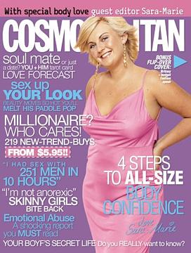
Possibly. And a dress made of sheet metal might hang better on a thin frame too—which is basically what this item resembles. Why should it surprise anyone that a modern style is more suited to a woman with no figure at all? Modern clothing is like modern art—it is designed to suit the taste of the creator, who couldn’t care less whether it actually enhances the appearance of the eventual wearer.
In some circles, this would be the end of the commentary, with just an impotent statement of frustration at the state of the modern world. But this site endeavours to find answers and alternatives, not just rehash familiar problems. And as ever, there is an alternative to the modern fashion world that is readily available, and it is to be found in the styles of centuries past.
We have quoted Kate Chopin’s classic novella The Awakening on our survey page for its description of Adele Ratignolle, which is one of the finest literary portraits of full-figured feminine beauty ever penned. But Chopin also takes care to describe what manner of clothing her plus-size character wears, and in two sentences she offers an exemplary guideline for plus-size fashion:
She was dressed in pure white, with a fluffiness of ruffles that became her. The draperies and fluttering things which she wore suited her rich, luxuriant beauty as a greater severity of line could not have done.
Modern fashion (for reasons which are not difficult to deduce) is all about “severity of line,” and couldn’t be more hostile towards a traditional feminine look. But a glance at the outfits worn by 19th-century actress Lillian Russell, perhaps the most beautiful woman ever photographed, shows us just how effective such attire was in enhancing the attractiveness of the female figure:

But perhaps someone might raise the criticism that fashions like those are too impractical for the modern world. Could anyone actually wear such an outfit today?
Consider then the garments shown in the paintings of 19th-century Austrian artist Eugene de Blaas:
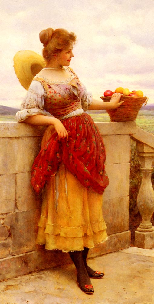
Much like John William Godward, his near contemporary, Blaas made a career of painting images of beautiful women; however, unlike Godward, who dressed his models in clothing supposed to resemble the garments worn by women in classical Greece, the subjects of Blaas’s paintings sport the actual folk attire worn by the women of his time, day to day, in all their sundry activities.
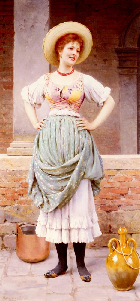
These outfits are therefore practical, but also lovely, and unmistakably designed to accentuate feminine curves. Straight-size women would look just as out of shape in these clothes as they would in Lillian Russell’s sumptuous attire. (Yes, out of shape—because in Blaas’s day, to be shapely meant to be curvaceous, as was the case in every era prior to our own.)
And to end on a hopeful note, maybe this yearning for a change in modern fashions is more than just dreamy nostalgia. Perhaps there is a light at the end of this particular tunnel. Consider the growing popularity of “peasant bouses” and “peasant dresses”:

That’s the gorgeous Rhiannon modelling for Torrid. These styles are “retro,” but not just retro to a decade or two past, but retro to a whole different century, and perhaps even to another continent. Here, finally, is a style of clothing that is trendy, popular, and absolutely looks better on a figure with curves.

Rather than trying to figure out which modern styles look good on full-figured women and which don’t, designers should go back to basics and rethink their approach. As soon as they create clothing that accentuates “the curve” rather than “the line,” designs that look better when they are actually worn by a curvaceous model rather than when they drop down flat on a dress hanger, the supposed “problems” posed by plus-size fashion will disappear. And if they are looking for inspiration for their styles, where better to turn than to centuries past, when the beauty of the fuller female figure was considered a given?
June 14, 2002
Kate Dillon: Goths and Curves
To review, the word “Gothic” pertains to:
a) the Germanic tribes, such as the Visigoths, who dismembered the rotting corpse that was the Roman Empire in its last days;
b) the Middle Ages;
c) the medieval-revival movement that was an integral component of Romanticism;
d) a modern-day rekindling of interest in things that are delightfully dark and spooky; or
e) all of the above.
The answer is “e,” of course The whole modern Goth trend is fascinating and full of imagination, and has paralleled the plus-size movement in an intriguing way. And why shouldn’t it? Goths celebrate an aesthetic which is alien to modern society—and plus-size beauty is similarly outside the prescribed boundaries.
Besides, this is a trend that encourages young people to read (and even write) poetry. What could be better than that? Some of the finest literature ever penned qualifies as “Gothic, according to one or another of the above definitions.
The link between Goths and curves is due in large part to one single, very famous layout in MODE magazine—one of the most memorable editorials that MODE ever produced: Kate Dillon’s “KateScape” layout in the September 1998 issue.
Anyone who thinks that MODE was not edgy, or didn’t speak to younger readers, must only know the magazine from its final years. In 1998, MODE was still breaking new ground, and had much more to offer teen readers than its short-lived Girl.
This was also a time when Kate Dillon was genuinely full-figured and at the very peak of her beauty—which is why the layout worked so well. An unattractive model could never have pulled off an editorial like this—the whole affair would only have looked ugly. But the tension between Kate’s rich, opulent figure and the daring makeup and costumes yielded exquisite results. This is precisely what full-figured Goth girls wanted to look like.
Very dark.
And very beautiful.
Don’t doubt it—today’s Gothicism is a rich part of the Aesthetic Restoration.
Cold eyelids that hide like a jewel
Hard eyes that grow soft for an hour;
The heavy white limbs, and the cruel
Red mouth like a venomous flower
When these are gone by with their glories
What shall rest of thee then, what remain,
O mystic and sombre Dolores,
Our Lady of Pain?
(Algernon Charles Swinburne, "Dolores")
June 16, 2002
Death Aesthetic vs. Life Renewal
A friend of the author’s works at the Toronto-Dominion Centre in downtown Toronto. Every morning, before he walks through the building’s main doors, he looks up at the black, dehumanizing slab of glass and steel in which his cubicle is located, and feels like he is entering a world in which Orwell’s most dire predictions have come true.

My friend’s situation is no different from that of the countless throngs who are pumped into every Modern City in the morning, and pumped back out to their homes at night. They all perform their clerical duties in little compartments in soulless, towering boxes, and they see their positions as parts of a bureaucratic machine confirmed every time they look around them.
But it could have been different.
Several years ago, I had occasion to visit a cousin in Chicago, and number one on my list of “things to see” was not the Field Museum of Natural History, nor even Chicago’s world-class art gallery, but a truly one-of-a-kind building, the only Gothic skyscraper in the world, the Tribune Tower.
In 1922, when Modernism was beginning to overrun all of the arts, the Chicago Tribune newspaper sponsored a competition for architects to design “the most beautiful and eye-catching building in the world,” and the winning design would become the newspaper’s new head office.
Naturally, most of the competition’s proposals adhered to the emergent Modernist trend. Here is one example:

Indeed, this design won second place, and ended up having considerable influence on the contemporary generation of architects, who raved about the idea of a hyper-democratic building without ornament or symbol, in which all of the workers would fit like identical units, without distinction—an expression of pure functionality, of the severest minimalism.
But Colonel Robert R. McCormick, the famously iconoclastic owner and publisher of the Tribune, would have nothing to do with this expression of (and vehicle for) social engineering. He could have gone along with the prevailing trend and accepted a bare, functional design, but he didn’t. In the face of withering criticism from the art establishment, he rejected the Modernist proposals, and awarded first place to a Historicist submission based on Neo-Gothic principles. Due to his vision, North America is blessed with at least one commercial building with high aesthetic credentials, one which hearkens back to the organic communities of pre-industrial times:

Here are two close-ups of the distinctive cupola, with its Gothic buttresses:


And here is the entranceway, with its lavishly carved stone and rich woodwork, more reminiscent of a great cathedral than of a newspaper office:

Alas, Colonel McCormick belonged to a different age—one in which informed laymen felt qualified to dismiss an artistically bankrupt vision when they saw it. And as we know, despite this single victory for Historicism, it was Modernism—and what tellingly became knows as the “International Style”—which became the de rigueur standard for all other skyscrapers ever afterward. A casual glance at any Metropolitan skyline, with the unrelieved monotony of its Mies van der Rohe glass boxes, will show you the legacy of this development.
What else could one expect of modern culture, which so often favours the banal over the fascinating and beautiful?
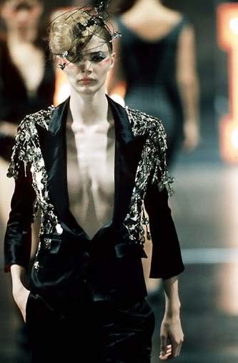
The comparison between the harsh, inhuman angularity of 20th-century architecture and the harsh, inhuman angularity of 20th-century feminine aesthetics is obvious. Supermodels such as Jodie Kidd fit in perfectly with the “death aesthetic” to which the Toronto Dominion Center gives expression:
To come to the point: it remains to be seen whether Lane Bryant has actually changed its criteria for selecting models, but we hope that it has. Because what the once-and-future vision of feminine beauty that we celebrate here requires in order to progress to the next level of popular acceptance—to stop being relegated to tiny images in corner boxes on magazine pages, and to be seen up-front on glossy covers and on the silver screen—is a Robert McCormick, a client that will dare to defy the established standards and received wisdom of industry insiders, a client that will dismiss as nonsense the hopelessly rigged “focus group” surveys (let alone the reported findings of other companies’ supposed studies) and actually listen to the people whom it serves. Such a client will bring beauty into the world—a kind of beauty that the public is longing to see—and will bring life to the culture again, like an ocean washing over a desert.
Even in a simple, commercial context, the world that we create around us can adhere to the “death aesthetic,” or it can be an affirmation of life.
June 29, 2002
